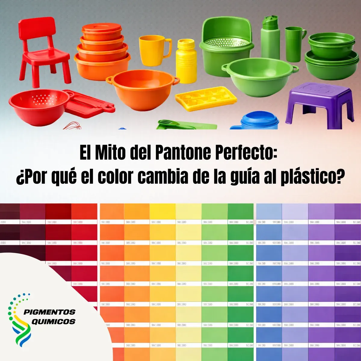
The Perfect Pantone Myth in Plastic: Why the Paper Reference Does Not Work in Polymers
The Pantone 286C approved by design does not match the plastic part. It is not a masterbatch error: Pantone was designed for paper, not plastic.
"Match Pantone 286C" is one of the most common — and most problematic — color specifications a masterbatch developer receives. The Pantone Matching System was designed to define color in paper substrates for offset printing. It was not designed to define color in plastic. Using it as a direct reference for masterbatch development produces inconsistent results because the substrate determines final color as profoundly as the pigment itself.
Why substrate dictates color: the physics behind the problem
Paper is a white matte substrate that absorbs light diffusely. Pigments in paper are suspended in a cellulose matrix that interacts predictably with offset printing inks. Plastic, depending on the base polymer, can be semi-transparent, translucent, glossy, or matte, with refractive indices that vary significantly between resins. Those substrate differences produce perceptible color differences even when the pigment is nominally the same.
This is not a formulation failure — it is physics. The optical properties of polypropylene, ABS, and PET are fundamentally different from the optical properties of coated paper. A pigment that absorbs and reflects light in one way on a paper substrate will behave differently in a polymer matrix, because the matrix itself participates in how light interacts with the pigment particles.
Metamerism: when the illuminant reveals the mismatch
Metamerism occurs when two materials with different spectral reflectance curves appear to match under one illuminant but differ under others. In masterbatch development, this produces the classic scenario: the plastic part and the packaging carton look identical in the design studio (under 5000K artificial illumination) but show a visible difference under direct sunlight at the point of sale (D65 illuminant).
Metamerism is inherent to the chemical difference between the pigments used in offset printing (oil- or water-based inks formulated for paper) and the pigments used in masterbatch (organic and inorganic pigments designed to survive processing temperatures). It cannot be eliminated, but it can be minimized by evaluating color under multiple illuminants from the first development sample, not only at final approval.
Three color references that actually work for masterbatch development
The correct protocol for translating a design color to masterbatch
The correct color development process for plastic masterbatch begins with accepting that the design reference is a starting direction, not an exact value to reproduce. The process: convert the PMS reference to L*, a*, b* values using spectrophotometry on the original paper substrate; produce a first masterbatch plaque in the client's base polymer using pigments with good initial correlation; evaluate color under at least three illuminants (D65 for daylight, illuminant A for incandescent, F11 for retail fluorescent); adjust masterbatch to minimize metamerism under the priority illuminants for the application; obtain final client approval on a polymer plaque, not on a paper guide.
The expected ΔE difference between a Pantone paper guide color and a high-quality masterbatch plaque in plastic is 2–5 units under D65, depending on hue and base polymer. This is inherent to the optical properties of the substrates and cannot be eliminated. With a correct development process, a ΔE of 1–2 units is achievable — the standard acceptance range in most consumer industries.