What Are the Color and Finish Trends for Plastic Packaging in 2026?
In 2026, plastic packaging moves toward mineral palettes, soft touch finishes from masterbatch, functional rPET transparencies, and formulations that communicate sustainability from the resin.
What Are the Color and Finish Trends for Plastic Packaging in 2026?
In 2026, plastic packaging is moving toward sensory color palettes (mineral tones, neutrals, and strategic neons), soft touch finishes achieved through masterbatch with touch additives, functional rPET transparencies, and color formulations that reinforce brand identity and sustainable commitment directly from the base resin.
Packaging color is defined from the resin
The plastics industry has reached an inflection point: packaging is the first contact between a brand and the consumer. In 2026, the color, finish, and functional properties of plastic packaging communicate values of sustainability, quality, and brand positioning before the product is even touched.
These decisions are made at the color concentrate formulation stage. Mass pigmentation — that is, masterbatch — is the point where color, texture, and functionality are integrated directly into the resin, before molding. This eliminates secondary processes, reduces costs, and ensures batch-to-batch consistency.
We share our technical and market analysis of the main color and finish trends for plastic packaging in 2026, from the perspective of the color formulator: the masterbatch manufacturer.
1. Dominant color palettes: from mineral to strategic neon
1.1. Mineral tones and earth palette
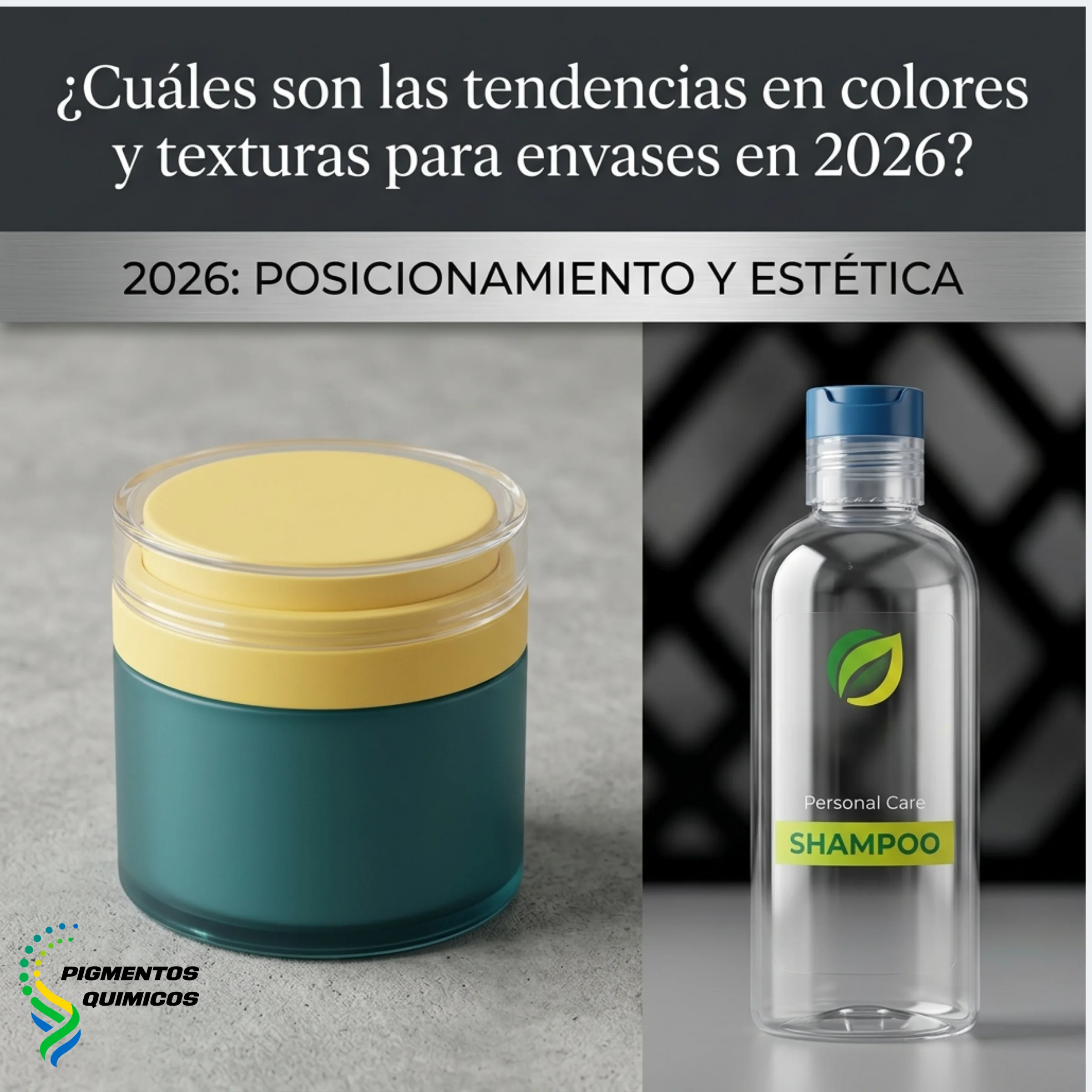
Our experience in the sector confirms that the mineral palette is consolidating as the most solid trend of 2026. The leading colors in this family are: clay green, stone blue, terracotta rose, butter, and cream. These tones convey calm, quality, and closeness — values increasingly demanded by consumers and retailers.
For packaging manufacturers, this trend materializes through masterbatch formulated with inorganic pigments in muted tones, designed to maintain thermal stability during injection and blow molding processes. Combining these colors with matte finish additives creates a premium product perception directly from the molded part, without the need for secondary coatings.
1.2. Cloud Dancer: the color of the year as a structural base
Pantone designated Cloud Dancer (Pantone 11-4201) as the 2026 color of the year: a soft, balanced white that functions as a base for minimalist designs. In plastic packaging, this tone serves a structural purpose: it allows other colors to stand out and communicates purity, sustainability, and sophistication.
From a masterbatch formulation perspective, achieving a white of this quality requires concentrates with high-purity titanium dioxide and controlled dispersion to avoid streaks or batch-to-batch variations. Our technical recommendation is to use it as a base in combination with mineral tones or with texture additives that add tactile depth without compromising color uniformity.
1.3. Functional monochromy and chromatic storytelling
We have observed strong growth in monochromy in premium plastic packaging. A single color as the visual axis reduces perceptual noise and allows the consumer to focus attention on the shape of the packaging, materials, and finishes. Neutral tones (warm whites, beiges, grays) lead this trend in cosmetic and pharmaceutical categories.
For the masterbatch formulator, functional monochromy raises the consistency requirement: when packaging depends on a single color, any batch-to-batch variation becomes evident. This demands concentrates with rigorous pigment dispersion control and precise dosing processes.
In contrast to chromatic restraint, bright and intense colors (vibrant yellows, luminous greens, saturated blues) are used strategically to stand out at the point of sale and generate immediate emotional response. This duality of monochromy/saturation defines the chromatic landscape of 2026.
1.4. Strategic neons: impact colors
For categories where shelf differentiation is critical, we have identified the rise of intense and bold colors: custom neons and vibrant purples that break monotony and capture consumer attention. This trend combines finishes that project a modern, accessible image, elevating the perception of premium pricing.
For color formulators, this represents a direct technical opportunity: the development of high-pigment-concentration masterbatch that maintains UV stability and chemical resistance under these demanding formulations. Fluorescent organic pigments require especially controlled dispersion to prevent degradation during high-temperature processing.
2. Finishes in plastic packaging: what can be achieved through masterbatch
2.1. Soft Touch: premium finish from the concentrate formulation
The soft touch finish is establishing itself as the standard of tactile excellence in 2026. Manufacturers leading this trend achieve that velvety feel directly from the masterbatch, without relying on subsequent coating processes.
By incorporating touch additives (special waxes and surface agents) into the color concentrate, the molded part comes out of the process with a silky, satin-matte finish that is pleasant to the touch. The advantages are clear: a production step is eliminated, unit cost is reduced, and the finish is guaranteed as an integral part of the piece, with no risk of peeling with use.
At Pigmentos Químicos we formulate our Soft Touch additive specifically for this application: a concentrate dosed alongside the color masterbatch during molding, delivering premium finish in a single production step.
2.2. Matte and semi-matte finishes from the resin
Matte finishes continue to gain ground in premium cosmetics, pharmaceutical, and food segments. When achieved through masterbatch formulation — using matting agents dispersed in the concentrate — the result is a uniform finish that does not depend on the mold or post-processes.
The technical advantage over external matte coatings is durability: a finish integrated into the polymer mass does not scratch or wear with handling of the package.
2.3. Tactile textures and relief: the role of color in the molded part
We have identified a trend responding to the saturation of AI-generated images: 2026 consumers value authenticity and controlled imperfection. In plastic, this translates into textures that simulate organic materials such as stone, leather, or wood, and surfaces with deliberate reliefs.
These textures are achieved primarily through the design of the injection or blow mold. However, masterbatch plays a decisive complementary role: the right color enhances the perception of the texture. A terracotta tone with a matte finish on a stone-type relief generates a coherent sensory experience. A poorly formulated color would destroy that effect. The combination of mold + masterbatch transforms a plastic part into packaging with identity.
2.4. Transparencies with functional additives: the invisible masterbatch
We have observed a growing trend toward ultra-high transparency PET and rPET materials in beverage and cosmetic packaging. These materials act as a lens that amplifies the color of the contained product, turning it into a visual selling point.
Here masterbatch changes its function. Instead of pigmenting, the concentrate provides functional additives: UV stabilizers, antioxidants, and anti-block agents that protect the package and its contents without compromising transparency. Translucent tints with very low pigment loading are also formulated to give a subtle tint (bluish, greenish, amber) that reinforces brand identity while maintaining optical clarity.
From a technical standpoint, next-generation rPET achieves optical clarity levels comparable to glass, with the added benefit of being recycled material. For brands, this transparency offers a dual argument: premium aesthetics and verifiable sustainable commitment. And to achieve this, they need an additive masterbatch that does not cloud what the resin already offers.
3. Chromatic sustainability: color also communicates responsibility
In 2026 consumers demand real proof that a package is responsible. On the chromatic level, this means earth-toned palettes and finishes that connect visually and emotionally with values of authenticity and nature.
From masterbatch formulation, sustainability translates into concrete technical decisions: selecting pigments compatible with the recycling processes of the base polymer, reducing the variety of concentrates per product line to facilitate post-consumer material recovery, and formulating with carrier resins that do not contaminate the recycling stream.
Monomaterial packaging with a single well-executed color demonstrates a real technical advantage: it simplifies the recycling chain and reduces production waste compared to solutions requiring multiple decorative layers or complex pigmentation. Our industrial perspective integrates this dimension from the formulation phase, ensuring that the chromatic choice is functional, aesthetic, and responsible at the same time.
Conclusion: Design color and finish with industrial intelligence
Color and finish trends for plastic packaging in 2026 are strategic decisions that impact brand perception, consumer experience, regulatory compliance, and production efficiency.
We have identified five key axes: sensory mineral palette, Cloud Dancer as structural base, functional monochromy, impact neons, and soft touch finishes integrated from masterbatch. To these is added the increasingly strategic role of functional additives in transparent packaging and sustainability as a formulation criterion.
Integrating these vectors into the plastic packaging production chain requires a vision that begins where color begins: in the formulation of the concentrate. If you wish to explore any of these trends applied to your specific sector, we invite you to review our articles on masterbatch formulation, functional additives, and custom color development.
Frequently asked questions (FAQ)
What colors dominate plastic packaging in 2026?
In 2026 two major chromatic families dominate. First, mineral and earth tones (clay green, stone blue, terracotta, beige) targeting premium and sustainable markets. Second, saturated or strategic neon colors for categories where point-of-sale differentiation is a priority. Cloud Dancer (Pantone 11-4201) acts as a structural base in minimalist designs. From a masterbatch formulation perspective, each family requires specific pigments with thermal stability and controlled dispersion.
What is soft touch finish in plastic packaging and how is it achieved?
Soft touch finish creates a velvety, silky, pleasant surface. It can be achieved in two ways: through subsequent coating (lacquering) or through touch additives integrated directly into the masterbatch. The second option eliminates a production step, reduces costs, and guarantees an integral finish that does not peel. At Pigmentos Químicos we formulate a Soft Touch additive designed to be dosed alongside the color concentrate during molding.
What role does masterbatch play in transparent rPET packaging?
In high-transparency packaging, masterbatch does not color. It provides functional additives such as UV stabilizers, antioxidants, and anti-block agents that protect the package without compromising optical clarity. Translucent tints with very low pigment loading are also formulated to give subtle tints that reinforce brand identity while maintaining transparency.
What is functional monochromy in packaging?
Functional monochromy uses a single color as the visual axis of the packaging to reduce perceptual noise, focus attention on shape and finishes, and convey values of sophistication. For the masterbatch manufacturer, this trend raises the batch-to-batch consistency requirement, since any color variation becomes evident when packaging depends on a single color.
How does sustainability impact color choices for plastic packaging?
Chromatic sustainability means selecting pigments compatible with the recycling processes of the base polymer, reducing the variety of concentrates per product line, and formulating with carrier resins that do not contaminate the recycling stream. Monomaterial packaging with a single well-formulated color simplifies the recycling chain and reduces waste compared to solutions with multiple decorative layers.
What is the difference between coloring packaging with masterbatch and decorating it with coatings?
Masterbatch integrates color directly into the resin before molding (mass pigmentation). This guarantees uniformity, durability, and lower unit cost. Coatings and inks are applied to the surface of the already-molded part (surface decoration). They are complementary processes: masterbatch defines the base color of the package and coatings add graphic information such as logos and regulatory text.